After a long delay, we're now able to start our coursework worth 30% of the GCSE.
The government has confirmed that coursework should continue and will be a key aspect contributing to teacher-assessed grades at the end of the course.
We had to wait back in the Autumn for the exam board to update their briefs for Covid-19 and then delay again due to lockdowns and the government announcing they would be replacing exams with a different system. However, we're now in a good position to work on this with all exam CSPs covered and the brief is a really creative one that we can work on from home.
Here's Tuesday's lesson video:
Coursework brief
Create a working homepage and one linked page for a website promoting a new independent, low budget film.
We have chosen a website brief for this year as this will allow all of us to work on coursework from home as well as once we're back in school. The coursework brief is here - with the details from the exam board regarding what can be submitted due to Covid-19. You'll need to be logged in to your Greenford Google account to view it.
The task is to create a website for a new independent low-budget film. This will include the homepage and one linked page with an interview with the director or another member of the production team. The creative side is that we will need to come up with our own new, original film idea.
The target audience for both the film and the website is existing fans of independent films and we're going to suggest you focus on the horror genre.
Create your website using Wix
We're going to use wix.com to create our websites. This is a simple, user-friendly and free site that AQA is happy for us to use and will really help us to create our website. Here's a tutorial explaining the basics in case you're interested to find out more:
To test it out, we've created an example film website using some A Level Media pictures from a different project. This is what we're trying to produce!
Low budget independent horror films
In order to complete this coursework, we need to come up with our own, individual, original idea for a low-budget independent horror film.
We will develop our film pitch next lesson. This is because we need to carry out research before creating our own work.
Website and film poster conventions
In order to create a professional-level media product, you need to use the codes and conventions we expect to see in those media products.
Here are the key conventions for a film website for an independent low-budget horror film:
- Title - in a particular font/typography to create a brand for the film
- Central image - usually making up most if not all of the homepage of the website
- Menu bar - usually containing options such as Trailer, Interviews, Reviews, Watch Online, Behind The Scenes etc.
- Tagline (like a slogan) that tries to draw the audience in
- Release date / how to watch the film
- Star/director/actor names
- Critic reviews
- Social media hashtags / icons
These are the key conventions for film posters - useful for planning your photography and design. Note that many are similar to film websites as they are critical elements of the marketing:
- Central image
- Title - in a particular font/typography to create a brand for the film
- Tagline (like a slogan) that tries to draw the audience in
- Release date
- Star/director/actor names
- Critic reviews
- Social media hashtags / icons
- Production blurb
- Iconography of the film’s genre
You will want to use some of these in your website design.
Coursework: Film website research
Create a blogpost called 'Coursework research and planning' and complete the following tasks:
Research: horror film websites
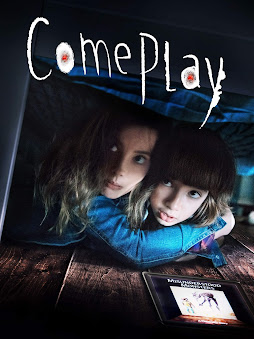
Visit the Come Play horror movie website.
1) How do you know that the film is from the horror genre?
2) How does the website make the audience want to watch the film?
3) Scroll down to see the whole homepage. What other content does the website offer?
Next, visit the Mothers Of Monsters horror movie website.
1) What font/typography and colour is used for the title of the film?
2) Scroll down to see the whole homepage. How is the film described in the 'About' section?
3) Keep scrolling down. What other content does the website offer?
Finally, visit this website for horror movie The Invisible Man.
1) What is the main image on The Invisible Man film poster (on the left of the website homepage)?
2) What is the tagline for the film? (Clue: it starts 'What You Can't See...')
3) How is the story of The Invisible Man described on the site?
Due date: on Google Classroom
Optional extension tasks
Horror film posters are a great way to plan the kind of photos you will need to take for your horror film website.
1) Research horror film posters - you could start with the low-budget horror films you've already researched above. What do you notice about the photography used?
2) What iconography can you see that creates connotations of the horror genre?
3) How could you use your phone to create a similar style images for your film website?


No comments:
Post a Comment